
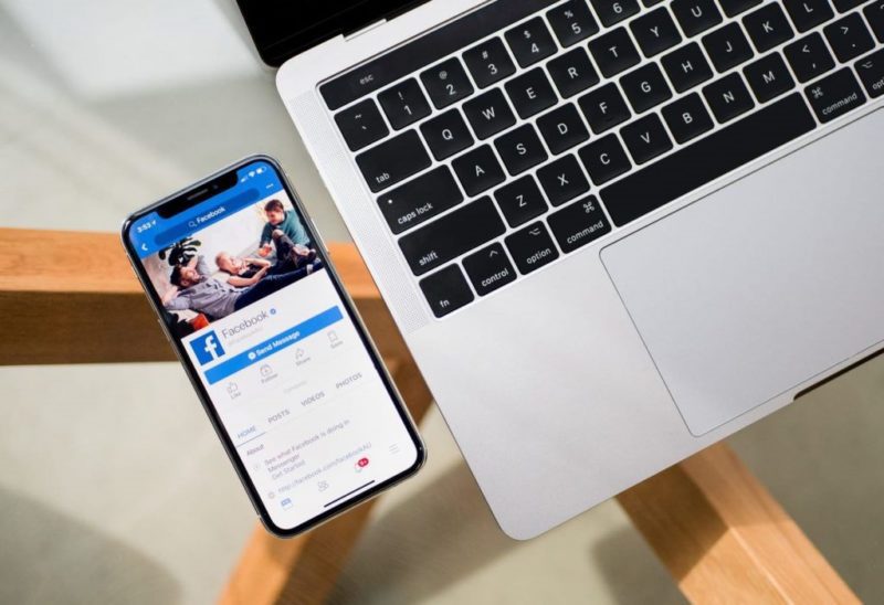
The popularity of smartphones has grown exponentially over the past few years. New statistics show that about 50 percent of internet traffic comes from mobile devices. That is why now, it can never be emphasized any better for your website to be viewable across all devices.
A responsive website gives your users a smooth experience regardless of whether they use a desktop or a smartphone to browse. It adapts its design to fit any screen size. If you’re still not convinced that you need this website, these nine reasons might change your mind.
Mobile Phone Users are on the Rise
While desktops are still significant, smartphone and tablet usage are growing. Currently, there are about 7.2 billion mobile phone users globally.
With online consumers spending more time on mobile devices every year, it’s essential to make your site suitable for all devices. Failing to do this could see you miss out on valuable customers and sales.
Today, technological developments have made it easy for anyone to create and own a responsive site. With a web builder tool like Editor X, you can create a professional responsive website without coding experience.
Google Loves Responsive Websites
In 2015, Google revealed that it would start favoring mobile-friendly websites in its search results. One reason for this significant decision is based on how fast mobile devices have overtaken desktops as a primary internet destination.
If you are SEO-oriented and want your site to rank higher on Google, don’t build separate mobile and desktop sites. Instead, create a single responsive one.
Smooth User Experience
Think about how frustrating it is to navigate through an outdated website. It’s often difficult to find what you’re looking for. Users can lose patience quickly when presented with annoying multiple layers of menus or hoops when browsing your site.
Responsive designs give your website a clean layout on different screens. Visitors can easily explore it without zooming on graphics or squinting at text-heavy pages.
Responsive Websites are Cheaper and Faster to Create
A responsive website costs much less money and time to create. You don’t need to spend hundreds of dollars hiring an experienced developer. Even better, you can create one without spending hours learning how to code.
In addition, having one site that can be accessed on mobile or desktop saves money in terms of hosting. Lastly, a responsive web maintenance procedure is less stressful than non-responsive websites.
Better Conversion Rates
Your number one reason for creating a website is attracting more people and converting them into clients. The only way you can achieve this is by making your site mobile responsive. Research shows that websites with responsive design have an 11 percent higher conversion rate than those without.
In fact, big-name companies like Amazon have had great success in making their sites user-friendly, and this is why they keep receiving more sales. And your case can never be any different if you ensure your website is responsive.
Reporting Analytics is Easier
Having a responsive website makes reporting analytics easier because users have access to your content in one place. You don’t have to create a duplicate page, which can be an extra load.
Your analytics software will be able to read all of your data and provide you with meaningful information. This helps identify potential issues and respond to customer concerns on time.
Faster Page Load Time
Fifty-three percent of mobile users are likely to abandon a site that takes more than three seconds to load. This means you need to do everything possible to optimize your website for faster loading on any device. A slow website can also push your ranking lower on search engines.
Why should you suffer all these when you can design your own user-friendly website with the help of easy-to-use web builder tools?
Lower Bounce Rates
Bounce rate happens when a visitor lands on your website and then leaves without clicking on other pages. A high bounce rate can negatively impact your SEO ranking.
Bounce rate happens for many reasons, including poorly placed ads, stressful navigation, and a poor user experience. A responsive site enables users to quickly find what they’re looking for, lowering bouncing rates in the end.
Users Can Browse Your Pages Offline
It’s not uncommon for Internet users to lose their network connection while browsing. Responsive web design makes it possible for all your pages to remain functional even when you’re offline by using stored content. Once you regain your internet connection, your browser updates any changes made during your offline browsing.
Conclusion
A responsive website allows your business to reach and communicate with more customers. With people viewing more sites from their phones, it could benefit you if you learn how to create and manage a responsive website. That way, you can easily have an edge over the competition.


